
The Analyze Data page has three tabs, Summary, Results, and Crosstable. Summary gives you the headline numbers. The other two answer different questions, and knowing which tab to reach for makes your data review much faster.
First, Select a Template
From the Walkthroughs page, click Analyze Data, choose a date range and a template, and click Submit. One thing to know: the Results and Crosstable tabs need a single template selected. If you choose All Templates, those two tabs are unavailable, because questions differ from template to template and cannot be combined into one view.
The Results Tab: How Did We Do on Each Question?
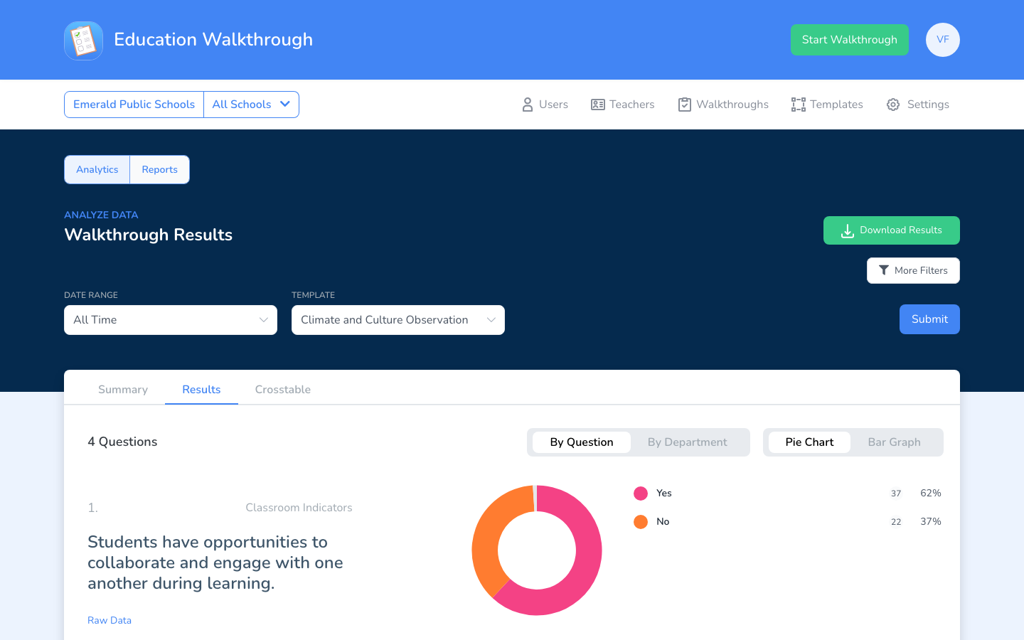
Results breaks down the answers for every question on the template, with a By Question view and a By Department view. Each question shows its answer distribution as a pie chart, and you can switch to a bar graph. Use Results when you want to know things like “what percentage of classrooms had clear learning targets?”
The Crosstable Tab: How Do the Numbers Compare Side by Side?
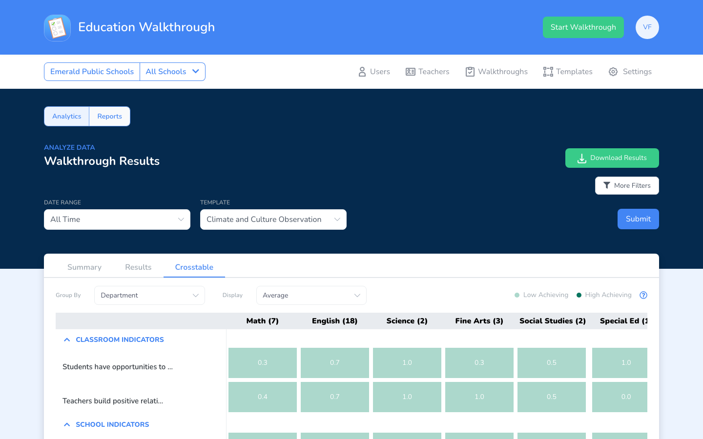
Crosstable lays out every question in one color-coded grid so you can scan patterns across the whole template at once. Use Group By to break the columns out (for example, by Department) and Display to choose the value shown, such as the average. Cells are shaded from low achieving to high achieving, so a principal can spot in seconds that, say, collaboration scores strong in Science but needs attention in Math.
Sharing What You Find
You can download results as a PDF to share with your leadership team. For the bigger picture of the analytics feature, see Understanding EW’s Advanced Analytics.
FAQs
Why is the Crosstable tab grayed out?
You are looking at All Templates. Select one specific template and submit again, then the Results and Crosstable tabs become available.
Can I filter to specific teachers or observers?
Yes. Click More Filters to add Teachers and Observers filters before submitting.