
Once you have completed a few walkthroughs you can start to analyze the data. This is one of Education Walkthrough’s most used features! The analytics share a snapshot of the walkthroughs that have been completed and also provide you with a clear visual to identify growth opportunities. You can even download a PDF of the results to share it with other peers. Let’s dive in!
Platform: Web Dashboard
Search
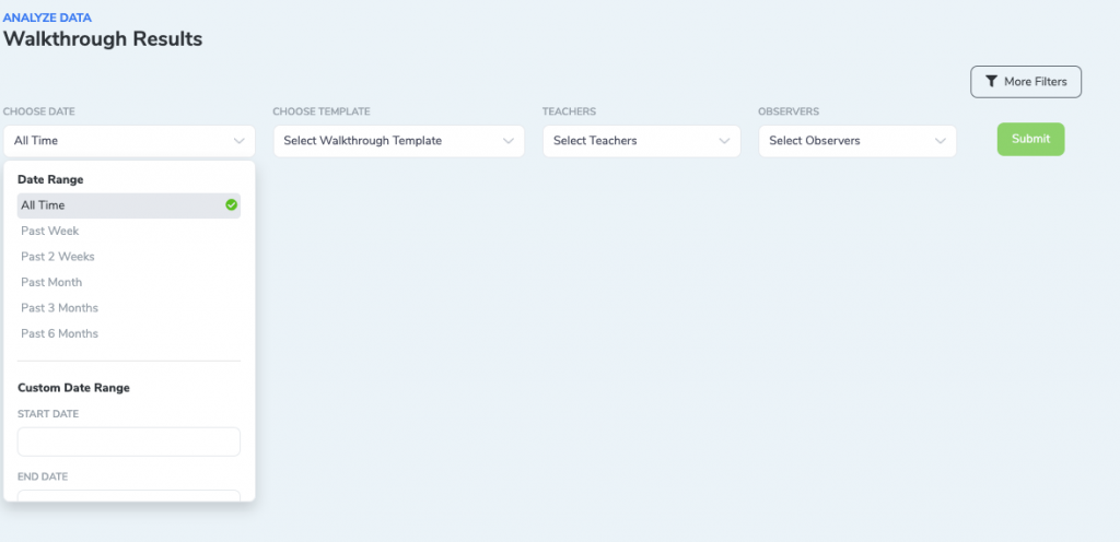
Search provides a few drop-down menus to give you ways to filter the data. By default Teachers and Observers are hidden but if you click the More Filters button, these additional drop-down menus will appear.
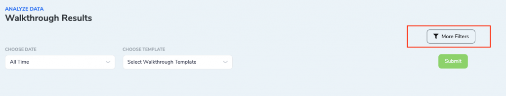
Search Options
- Choose Date – You can choose a set date range or select a custom date range.
- Choose Template – You can select or search for a template
- Teachers (optional) – You can select all or specific teachers
- Observers (optional) – You can select all or specific teachers
Summary
At the top of the Summary page, you will see the total number of walkthroughs completed, the average walkthrough duration, and the unique teachers that were observed during that period. As you scroll down you can see more details about the walkthroughs, observers, teachers, and departments during the selected period.
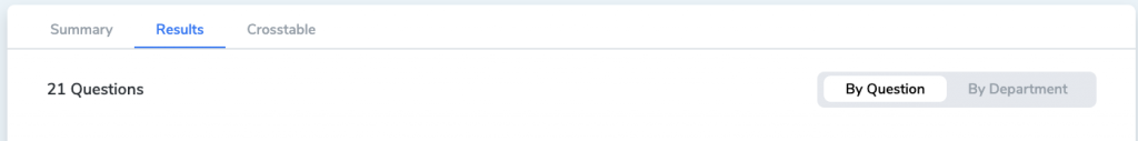
Results
Next to Summary, click the next tab to see the Results page. The Results page shows a breakdown of all the walkthrough questions and percentages of answers. On each question, you can see the comments associated with the question and the raw data.
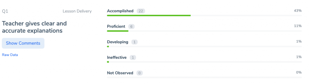
You can also view the results per department by clicking By Department in the top right corner.
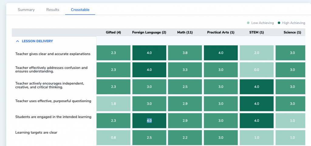
Crosstable
Next to Results, click Crosstable. Crosstable will show you a visual map of all the domains/sections, and questions displayed per department. You can scroll down or sideways to see more information.
The darker green shows the higher score while the lighter green shows lower scores. The score is calculated based on the option choices:
- Accomplished – 4 points
- Proficient – 3 points
- Developing – 2 points
- Ineffective – 1 point
- Not Observed – 0 points
Frequently Asked Questions (FAQs)
How many walkthroughs do I need before the analytics become useful?
The analytics page will display data as soon as you have completed walkthroughs. However, trends and patterns become more meaningful once you have at least 5-10 walkthroughs completed for a given time period and template.
Can I download or export the analytics data?
Yes. You can download a PDF of the analytics results to share with colleagues, administrators, or your leadership team. Use the download option on the analytics page.
What does the Crosstable view show?
The Crosstable provides a visual heat map of all sections and questions displayed by department. Darker green indicates higher scores, while lighter green indicates lower scores. This makes it easy to identify areas of strength and areas that need support at a glance.
How are the scores in the Crosstable calculated?
Scores are based on the option weights assigned to your template questions. The default scoring is: Accomplished (4 points), Proficient (3 points), Developing (2 points), Ineffective (1 point), and Not Observed (0 points). You can customize these weights in the Template Builder.
Can I filter the analytics by a specific teacher or department?
Yes. Use the filter options at the top of the analytics page to select specific date ranges, templates, teachers, and observers. Click More Filters to reveal additional filtering options for teachers and observers.
What’s Next?
- How to Access Pie Chart Data Visualization — View your walkthrough data as pie charts for a different perspective on your analytics.
- Export or Download Walkthrough Data to a CSV — Export your raw walkthrough data for deeper analysis in a spreadsheet.
- Assign Weights to Template Question Options — Customize the scoring weights in your templates to get more meaningful analytics results.